Proofreaders’ marks — the “printers’ shorthand” known to every compositor, typesetter, editor, and advertising copywriter
Every conscientious writer and printer wants his or her work to be attractive, easily readable and correct but much can go wrong through the many steps in the production of effective printed material. It may be said with confidence that none of those steps is more important than proofreading.
Poor proofreading may delay the process of printing but, even more troubling, it can be costly when a serious error goes undetected and the job has to be rerun. Think of the cost of rerunning an entire magazine because an embarrassing misspelling on the front cover is missed in proofreading. It happens. The Printer’s Devil knows!
In the production of print advertisements, copy refers to the entire matter being reproduced. In fact, whatever the copywriter gives to the printer is called copy. When the printer receives copy, that copy must be accurate in every detail, or errors will certainly mar the final result.
Before computers came on the scene everything that appeared in a newspaper or magazine advertisement — or a brochure, a folder, a catalogue — was submitted by the copywriter to the printer in typewritten form, together with a hand-drawn layout setting out the design of the advertisement, showing how the components were to be arrayed.
The components of an advertisement include the headline, subhead, body copy, illustrations, slogan, border, and signature, i.e. the advertiser’s name, contact information and logo, and white space. (See the post showing how white space was used creatively by The New Yorker magazine.)
Advertising copy began at the typewriter — today it’s the computer. There’s always lots of opportunity for typewritten errors! The typist is the spell-checker!
The copy was “marked up” for the printer. The printer needed to know:
- The width in picas to which the type is to be set. A pica em is 12 points or one-sixth of an inch.
- The typeface and font size and weight of type to be used.
- Where to set the type in caps, small caps, lowercase, roman or italics.
- Whether the type is to be set solid or leaded (thin strips of metal inserted between the lines of type).
- Paragraph indentations—whether to set justified, flush left or right (no indentations)
- Any special instructions or out of the ordinary instructions about word spacing or irregular setting such as staggered setting (ragged on both sides).
In letterpress printing the assembly of all the material required for a given printing job is called “Make-up”. It includes the display lines , e.g. headlines and subheads which are set by hand or from the Ludlow machine; the body matter which comes from Linotype or Monotype; and engravings that will reproduce the photographs and illustrations. Lots of opportunities for errors!
All of that output is assembled in a steel tray called a galley. Blank areas are filled with leads and slugs, quads and furniture, all of which are lower than type height which is .918 of an inch. Leads and slugs are strips of lead used chiefly for putting space between lines of type; lead quads and blocks of wooden furniture are used to fill large “white space” areas.
When the compositor has completed the assembly of all the type and engravings, he ties a string tightly around it and sends it to the “stone”, which was once a slab of marble but, more commonly today, is a steel-topped table. Once a printing job has “gone to the stone” it is too late to make any corrections or alterations.
So, before a job goes to the “stone” the printer will pull three proofs of the copy for the copywriter to review and correct if necessary.
Proper copy preparation, then and now, ensures that proofs meet expectations. No surprises!
With proofs in hand, the copywriter must now communicate desired changes with the composing room, with the typesetters and skilled make-up men who assemble the type and the engravings in page form.
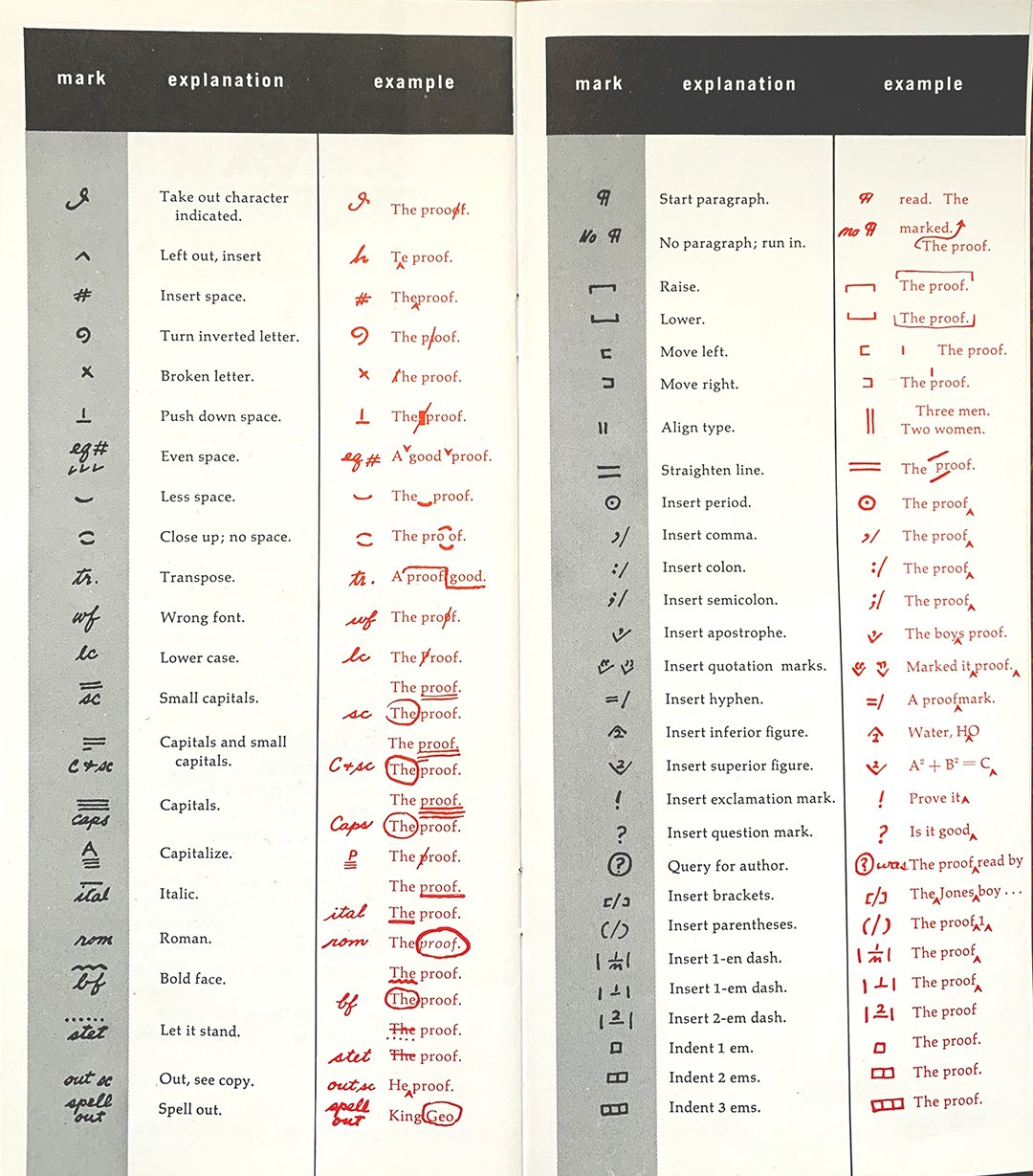
Proofreaders’ Marks are the shorthand known to everyone in the printing business. Here are the marks which evolved as standard throughout the industry

Proofreaders marks: Published by the Toronto Typographic Composition Association.
Editors’ and proofreaders’ marks can be categorized. There are marks that address:
- The size and style of type: capitals, small-caps and lower case, italics and boldface.
- Position and alignment, transposition, widows and orphans. A widow is a lone word or short group of words that appears at the bottom of a paragraph, column or page. An orphan is a similar unwanted straggler, but this describes words that appear at the top of a page. Widows tend to make long sections of text look unbalanced and messy, as well as leaving too much excess white space at the end of a page. Orphans really belong on the previous page, as not only do they look untidy on the page they appear, but they also break the flow of reading across two pages.
- Spacing: of words, lines and paragraphs. Add space or take it out, close up words, letterspace
- Insertion and deletion
- Punctuation and hyphenation: commas, colons, semi-colons, quotation marks
- Paragraphing: indent a paragraph or flush, justify,
- Marks, signs and symbols especially when using mathematical symbols or words from other languages.
The marks come in pairs, one written in the margin to flag the correction, the other in the body of the copy at the exact point the correction is to be made.
It is critical that proofreaders’ marks will be clearly understood by the typographer.
Proofed and corrected copy might resemble this when it is returned to the printer.
Please note: no typesetter would ever set type in this fashion. This example has been set using a personal computer. A professional typesetter would change the word spacing and even the letter spacing to ensure that hyphenation is correct and readable and that widows and orphans don’t happen.


It was critical that proofreaders’ marks would be clearly understood by the typographer. Although all type composition by compositors and linotype or monotype operators was checked by the typographer, the typesetter had no authority to make any changes, except by the express direction of the customer. The typographer was not responsible for mistakes so accurate proofreading by the customer was imperative for his or her own protection.


